



Perfecti is a dining companion that makes service feel both effortless and personal.
Its offering serves a narrow segment of fine dining guests, yet the earlier brand identity failed to reflect that audience.
We worked with the Perfecti team to rethink their brand architecture. Guided by market research and customer insights indicating a higher proportion of female patrons, we developed an identity that captures the core audience while remaining flexible for wider appeal.
 What we created
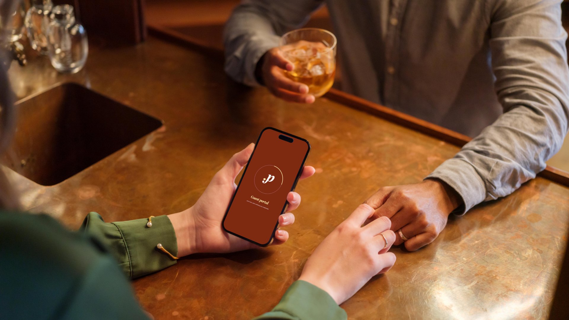
It needed an identity that felt like the dining room, not the app store.
Perfecti gives guests and servers a way to know each other before the order is taken. Guests can share preferences and allergies, and both sides can message each other directly.
It works at any table-service restaurant, with no buy-in needed from the restaurant. The earlier brand spoke none of that language.
A Logo With a Hand in It
A flowing script that feels written, not generated, with a logomark compact enough for the smallest screen.
A Palette That Sets the Table
Brandy, Vanilla Custard, Lavender Veil, Olive and Bronze Spice. These are the warm tones that already belong in a dining room.
A System Built to Repeat
Clear rules and a custom icon set, so every touchpoint, from the app to the table, looks like the same brand.
We started with the guests, not the software.
Market research and customer insight showed that a higher proportion of Perfecti's patrons are women, and the earlier identity had no answer for that.
The Brief
Rethink Perfecti’s brand architecture so it reflects the audience it serves.
The Goal
Capture the core audience without closing the door on a wider one, and hold that identity steady across every touchpoint.
The Insight
Fine dining guests notice details. The brand had to feel considered at every size, from a full-width hero to a favicon.
Who it speaks to
Guests
Anyone who eats at a casual, table-service restaurant and wants the experience to feel a little more personal. Early response has skewed slightly female, drawn to the safety and familiarity that reciprocal profiles create.
Servers
The people who make every table work. For them, Perfecti has to feel like a tool that respects their time and their craft. A clean, readable system keeps it quick and intuitive.
The Restaurant
Perfecti doesn’t need a restaurant’s sign-off to work, but it still has to look at home in the room. A palette drawn from the dining room itself lets it sit naturally beside any venue’s own brand.
Logo variations

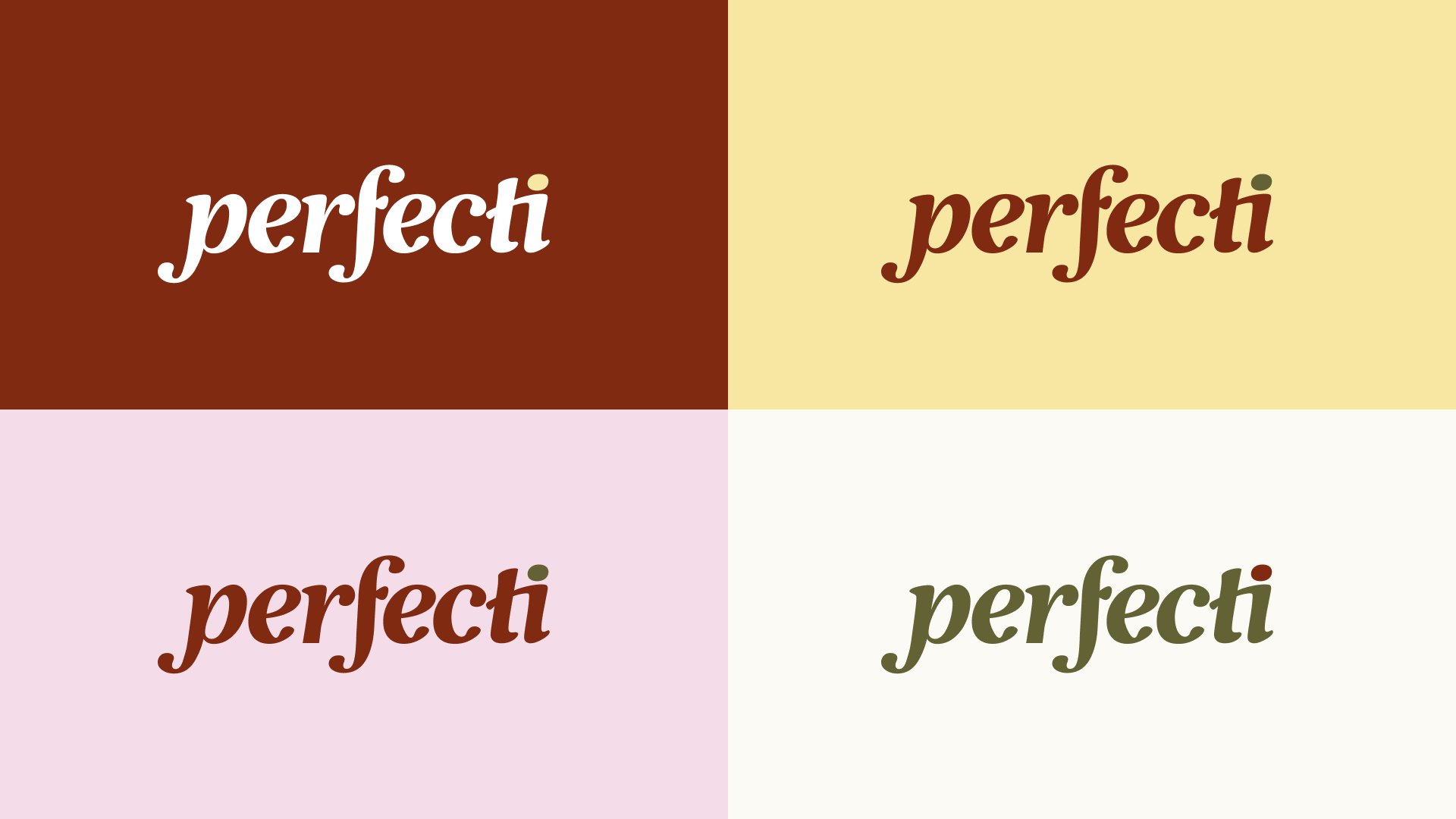
Primary Logo
The full logotype in Brandy with an olive dot. It leads on headers, packaging and any space wide enough for it to breathe.

Logomark on Oval
The P in Perfecti and i dot set inside an oval. It’s built for social avatars, app icons and favicons.

Logomark
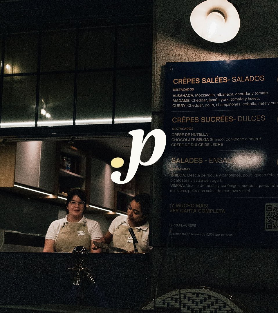
The p and dot on their own, for watermarks, tight interface elements and contained spaces.

The logo can sit in any corner of a layout or centred within it. It can also turn 90 degrees in either direction, always facing the side of the page with more space ahead. This lets it run vertically along the edge of a frame without losing its flow.
Colour from the table
Perfecti’s palette comes from the table itself: warm neutrals, deep reds and olive greens, the tones that already belong in a dining room. Brandy and Vanilla Custard anchor the system as the primary pair, carrying the brand’s premium-but-approachable balance into every touchpoint. Bronze Spice and Lavender Veil add warmth and softness. Olive keeps the palette grounded rather than sweet. Shadow Grey and Porcelain do the quiet work of text and backgrounds.
Typography
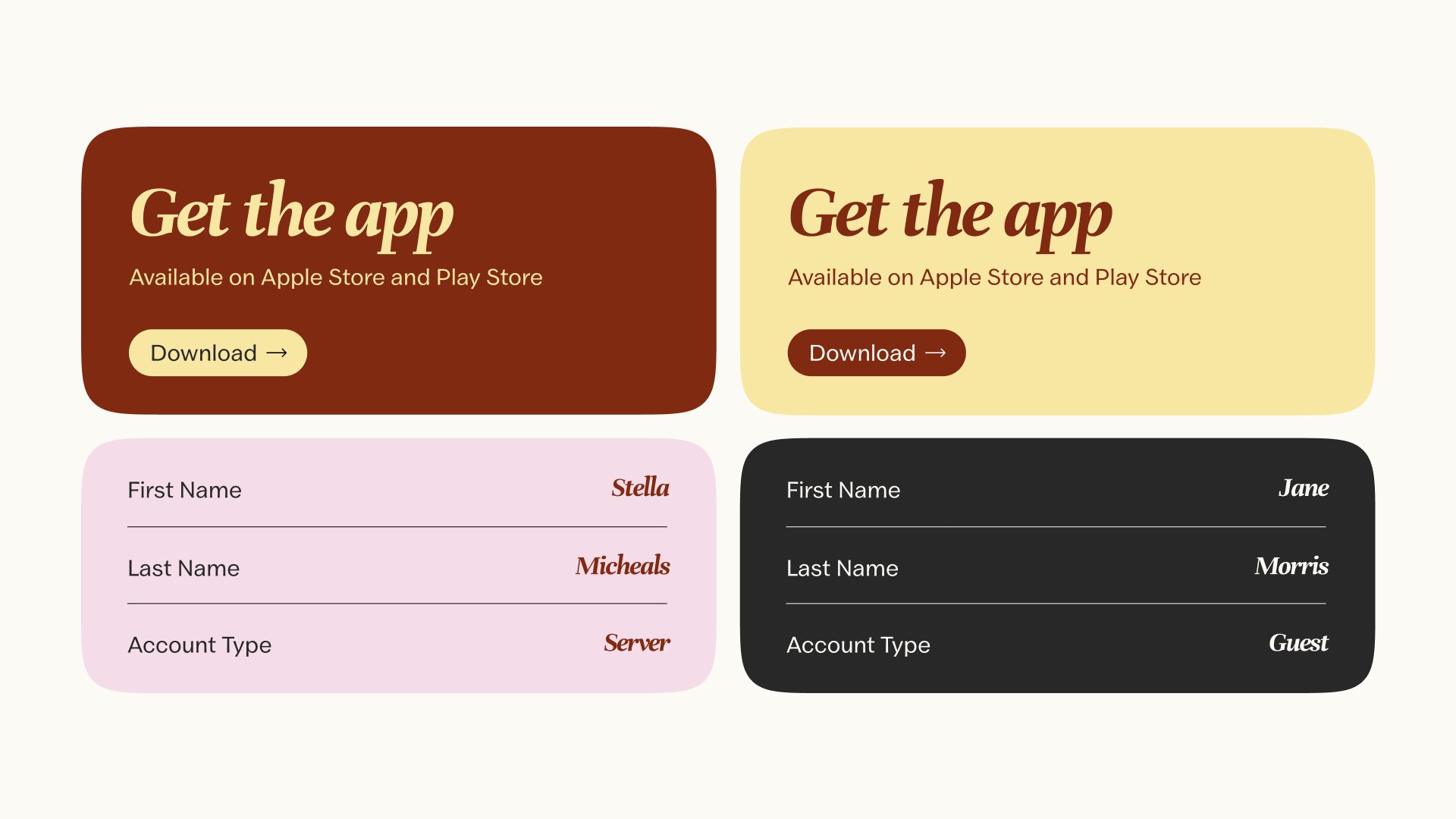
A display serif carries every big moment: hero headlines, section titles, the type meant to be felt before it’s read. Its detailing gives Perfecti an editorial confidence, closer to a well-set menu than a tech interface, without tipping into anything stiff.
A clean sans serif handles everything else: subtitles, body copy, captions and labels. It’s unfussy by design, so it stays legible at any size, in the app or on a printed card. The serif brings the personality. The sans keeps the experience easy to use.
Custom icon set
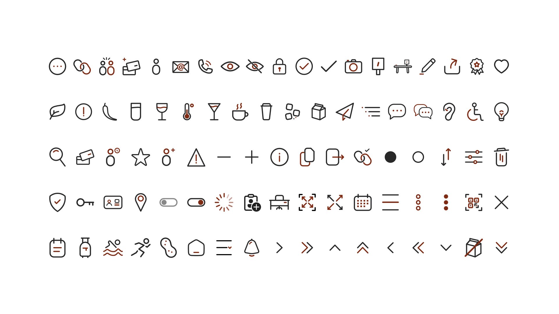
Beyond the core identity, we designed a full icon suite for Perfecti’s mobile app. Each icon is drawn in a single Shadow Grey line weight with rounded ends. A touch of Brandy picks out the detail that matters: the wine in the glass, the heat in the thermometer, the active state in a toggle.
The set covers service, dining, accessibility, dietary notes and navigation, so the app speaks one visual language from the first tap.
The brand in context
Perfecti lives where people eat: on terraces, behind the pass and at the bar under low evening light. The identity was built to hold up there.
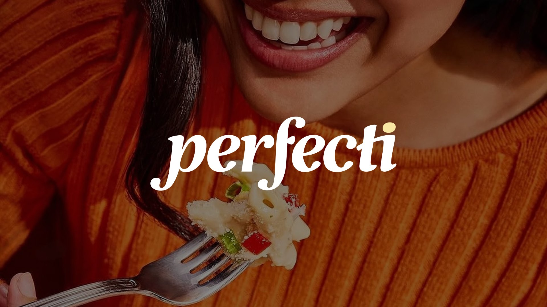

Set vertically along the edge of a frame, it leaves the subject room to breathe and still reads at a glance.
The logomark earns its place in the tightest spots. Against dark interiors and crowded backgrounds, the p and its Vanilla Custard dot stay legible and unmistakably Perfecti.
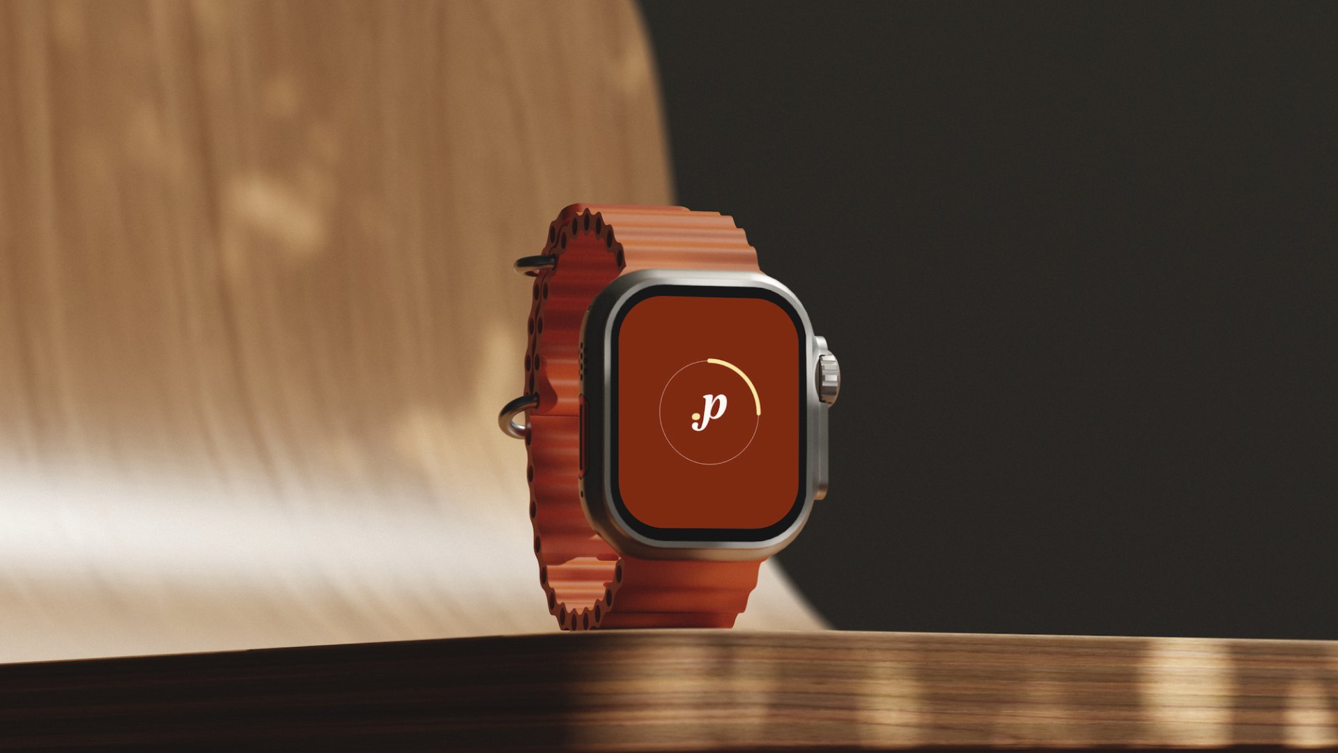
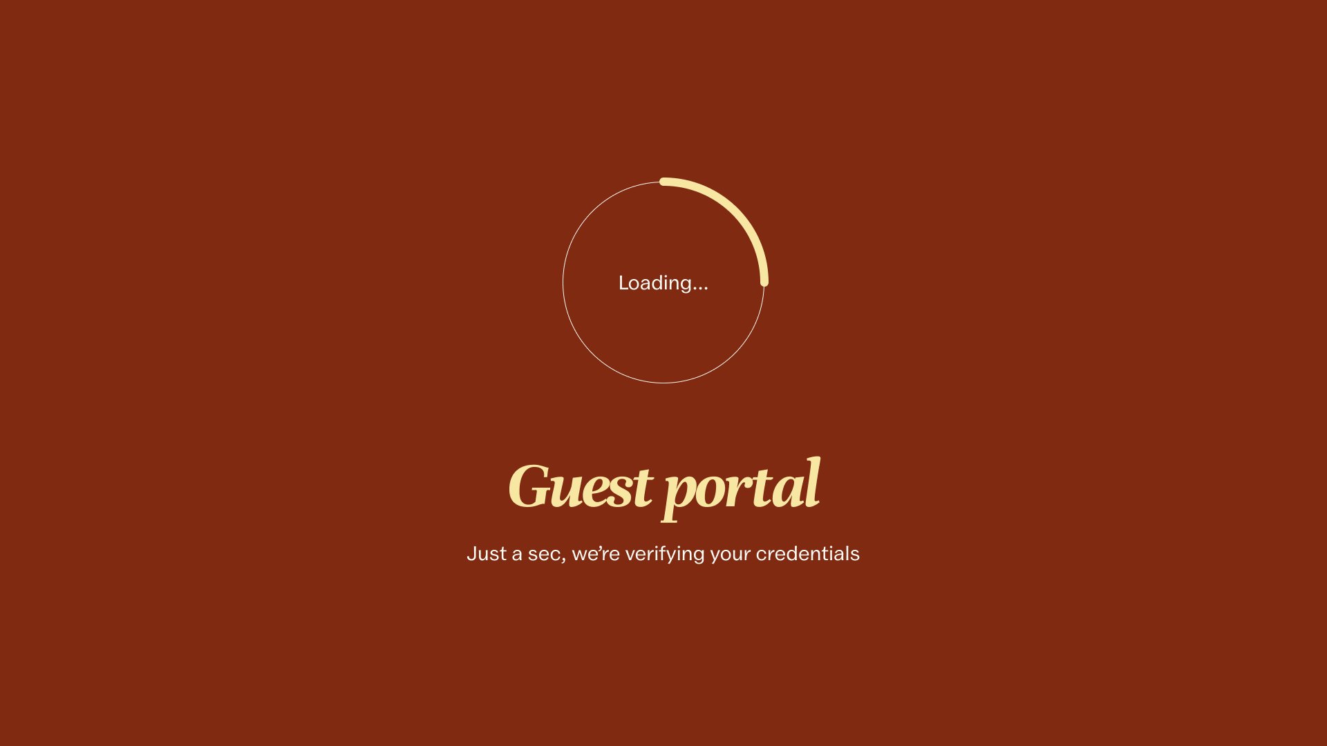
On screen, Brandy floods the moment of connection, with Vanilla Custard and Porcelain keeping every word clear. The same warmth that greets a guest in the app carries through to the table, so the brand feels like part of the meal, not something added to it.
Across photography, interface and every surface in between, the system stays the same:
one script, one dot, one warm palette.
The impact
A brand that finally looks like the people it serves, on both sides of the table.
A logo system that works from a full-width hero down to an app icon.
Clear rules for spacing, rotation, colour and type keep every touchpoint recognisable.
A custom icon suite that carries the identity deep into the product.
What we learned
Design for both sides of the table.
A two-sided product needs a brand both sides trust. Every choice had to work for the guest and the server alike.
Start with the people.
Early response from Perfecti’s users shaped the warmth of the script and the softness in the palette.
Small marks carry big weight.
A single dot over an i became the brand’s most flexible tool.