

Feed The Land is a youth-led, mission-driven nonprofit that builds community-powered networks linking underserved areas to genuine, nourishing food while backing local regenerative farmers.
We partnered with Feed The Land to design a comprehensive brand identity system that offers a world every stakeholder can engage with. The identity feels youthful and organic, yet conveys intentionality, trust, and commitment to its mission.
 Brand Logo
Logo Variations
Color Palette
Typography Set
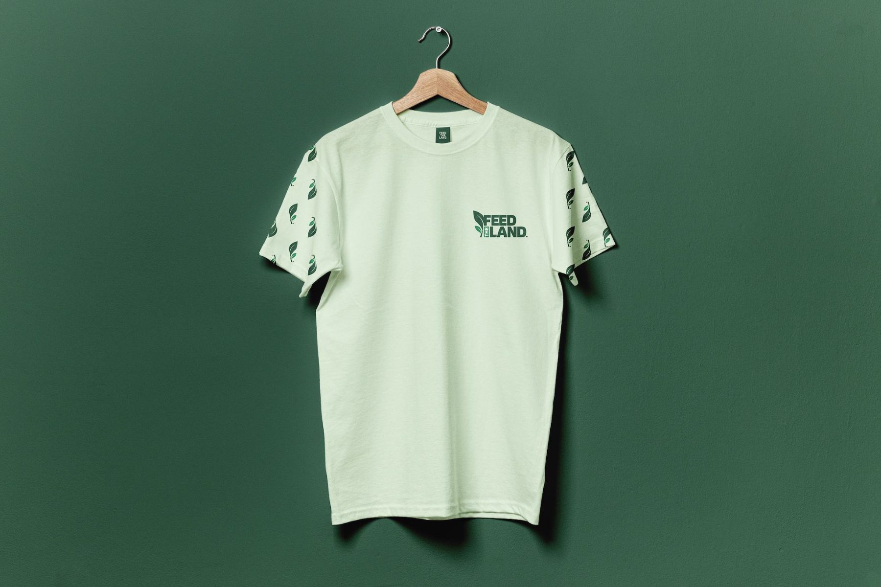
Brand Pattern
Brand Guidelines
Custom Illustrations
Feed The Land asks people to vote with their dollar for a future where farmers are valued, communities are nourished and the land is cared for.
That message has to land with donors, everyday people, farmers and the young people driving it. Each of them needs a reason to trust the brand, and none of them should feel like an afterthought.
Our Response

A Mark That Grows
A leaf and its sprout, drawn to read as one plant at every size.

A Palette From the Ground Up
Greens from the field, brown from the soil and a bright gold for the energy of the people leading it.
Two Modes of Expression
A clean, mission-forward core brand, and a playful marketing layer with hand-drawn moments that make the message feel human.
Who It Speaks To
Communities
The people Feed The Land serves need to feel respected, not pitied. Honest, documentary-style photography and warm greens keep the brand human and free of charity clichés.
Regenerative Farmers
The growers at the centre of the food system need to feel backed as partners. Earth Brown and a leaf mark rooted in working land speak their language.
Youth Organisers
The young people running the network need ownership and energy. Bold display type, Bright Gold accents and a handwritten marketing voice give them both.
Donors and Partners
The people funding what comes next need confidence the mission will last. A consistent system with clear rules shows them it will.
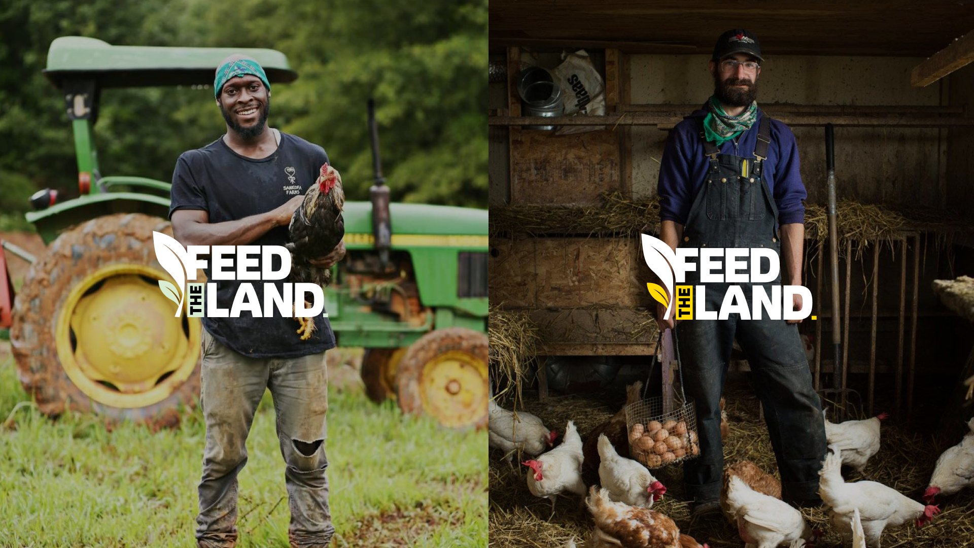
The voice ties them together: trustworthy enough for donors, friendly enough for everyday people and bold enough to spark curiosity.
The Mark
The mark is a single leaf rising in a long sweep, with a smaller sprout breaking from its base. Read together, they show something established making room for something new, which is Feed The Land in one shape.
The Leaf
Steady, upright and rooted, it stands for the land and the farmers who work it.
The Sprout
The smaller leaf stands for new growth and the young people leading the work.
The Stacked “THE”
Set vertically in a box between the mark and LAND, it ties both words into one compact block.
The Full Stop
LAND closes with a small square in Earth Brown, a piece of soil at the end of the name.
Logo Variations
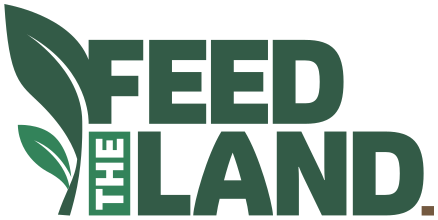
Main Logo
The stacked lockup for high-impact moments, from website heroes to official brand documents.

Horizontal Logo
The full name on a single line for navigation bars, email headers and banners.
feedtheland.orgWith Website URL
Stacked and horizontal versions paired with .org, for awareness-driven designs that need to send people online.
Leaf Mark
The leaf and sprout alone, for profile images, favicons, watermarks and subtle brand stamps.
FMonogram
The leaf paired with an F, for app icons, highlight covers and small corner branding.
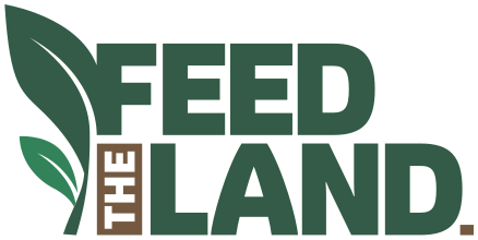
Earth Brown Versions
A secondary set where “THE” is set in Earth Brown, adding warmth to storytelling-led designs, educational content and visuals with earthy photography.
Colour, from the ground up
The palette reflects the brand’s connection to soil, food and regeneration while keeping the identity bold, fresh and trustworthy. The greens form the foundation, standing for growth, health and environmental responsibility. Frosted Mint adds openness for clean, optimistic layouts. Bright Gold brings youthful energy to highlights and calls to action, and Earth Brown grounds the palette with warmth.
Typography
A bold display typeface carries headings, titles and key subtitles. It has the authority of a strong sans serif, with subtly organic details that set it apart from the conventional ones.
A clean, closely matched sans serif handles body text, captions and anything that needs to be read in detail, so the whole system feels like one voice.
For marketing, a handwritten typeface adds a personal touch. It’s used sparingly for highlighted words, short callouts and campaign headlines, always supporting the message and never replacing clarity.
One brand. Two voices.
A clean, mission-forward core brand, and a playful marketing layer with hand-drawn moments that make the message feel human.
Illustrations
The custom illustrations are simple, hand-drawn and slightly imperfect, with bold outlines and organic shapes. Leaves, seeds, soil, hands and donation moments communicate ideas quickly, with soft touches of the brand palette and nothing polished or corporate about them.
The Brand in Context
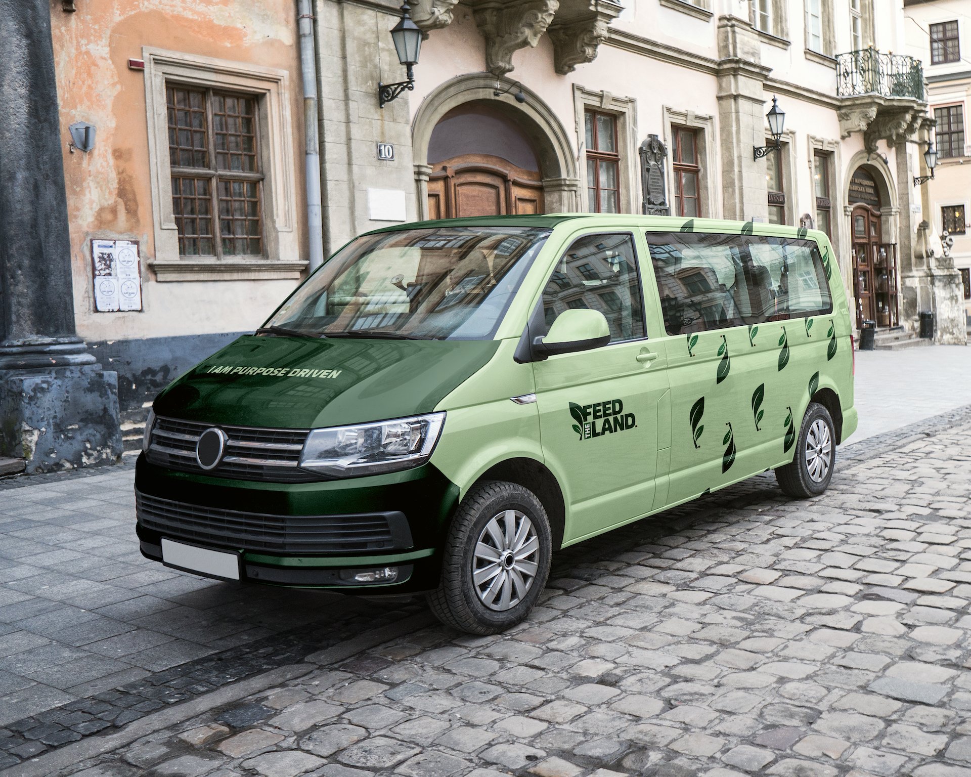
An identity proves itself away from the artboard. Here the system meets real light, real texture and real places.
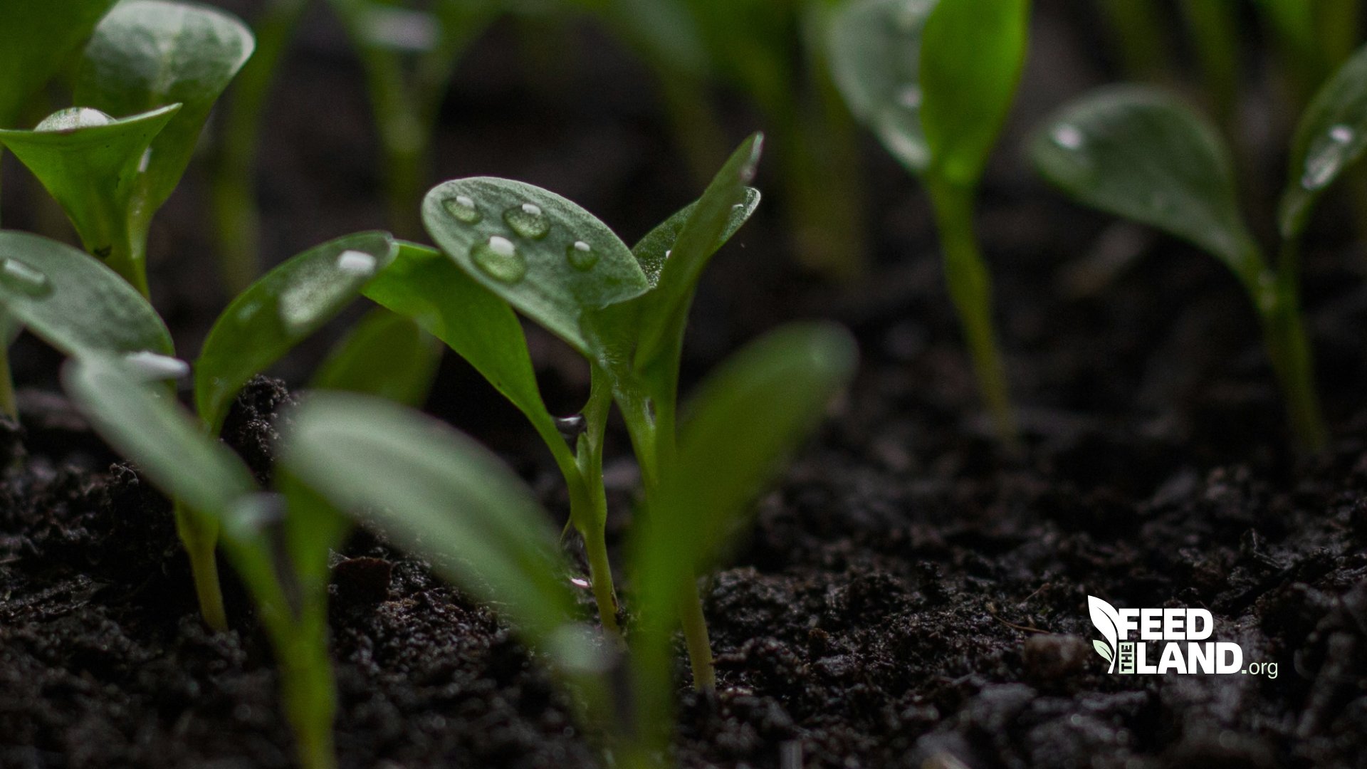
The white logo sits quietly in a corner and lets the image lead.
Against dark, rich soil and young seedlings, it reads as part of the scene, with the .org version pointing people straight to the mission.
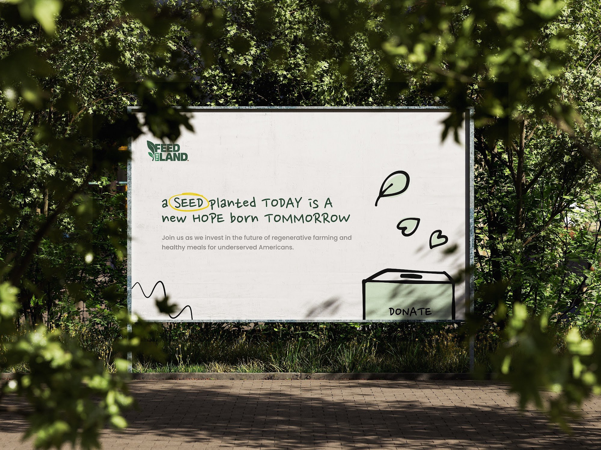
A handwritten headline with a single word circled in Bright Gold, hand-drawn leaves and a simple donation illustration turn a large outdoor surface into an invitation. Framed by real foliage, it feels like it grew there.
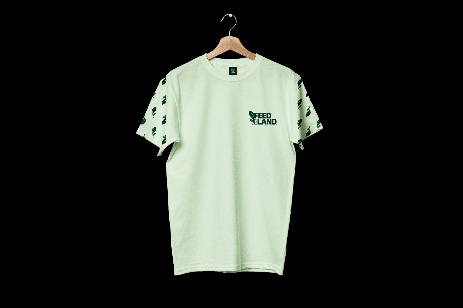
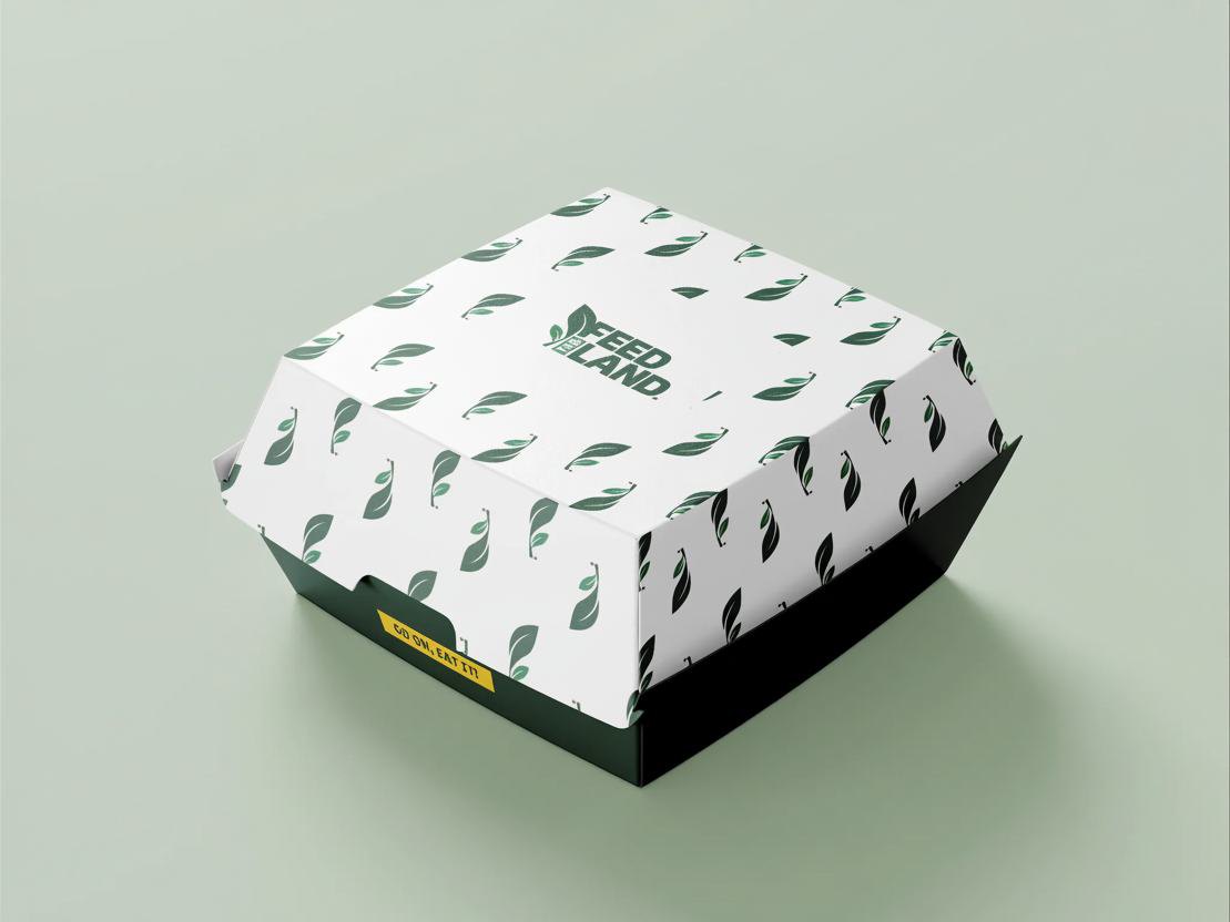
Even reduced to the leaf mark alone, the brand holds. A white leaf and a Bright Gold sprout on Deep Forest are enough to say Feed The Land.
The Impact
Recognisable
A mark and pattern that identify Feed The Land at a glance.
Flexible
Six logo variations and Earth Brown versions that cover every format, from favicons to wide banners.
Human
A marketing layer with handwritten type and illustrations that makes the mission feel approachable.
Credible
An identity and voice that gives donors and partners a reason to take the mission seriously.
What We Learned
Design for every seat.
A brand with four audiences can’t favour one. Each choice had to work for the farmers and the funders alike.
Two modes, one brand.
A clean core and a playful marketing layer let the identity stay trustworthy and still feel young.
Systems over single pieces.
The pattern, palette and leaf mark had to carry the brand when the full logo couldn’t.