


Eccentric Earth is a gateway to mindful, sustainable living: products that care for the person using them and the planet they come from, made with natural ingredients and eco-conscious packaging.
We built a warm, nature-led identity that makes that care feel approachable, curious and full of possibility.
 Brand LogoLogo VariationsColor PaletteTypography SetBrand PatternBrand Guidelines
Natural wellness brands tend to look alike. Eccentric Earth doesn’t.
The category is crowded with soft greens and quiet leaf motifs that blur together. Eccentric Earth needed an identity that still felt rooted in nature, but carried enough personality to live up to its name and speak to both adults and children.
Our Response

A mark with movement
Stacked, flowing strokes form the brand’s initials and move like wind through grass.
A palette from the ground
Forest Green sits at the core, warmed by sunset oranges and softened by a sandy neutral.
A pattern made from the mark
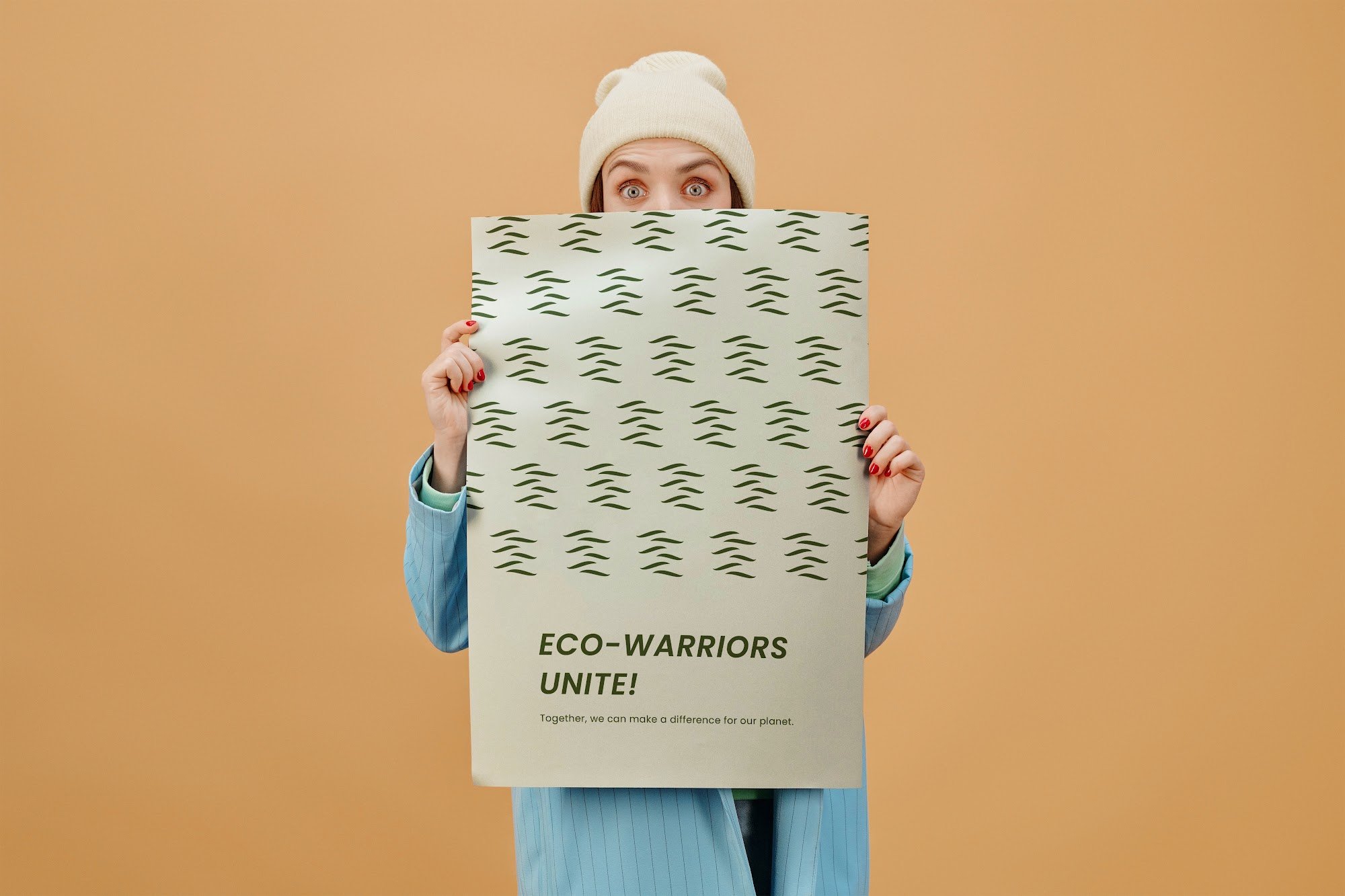
The logomark repeats into a textured field, giving every surface character without adding visual noise.
Personal wellness and care for the planet, held together.
We began with the two things Eccentric Earth refuses to separate. The identity had to hold both without leaning too far into either.
The brief
Create a warm, character-driven identity that captures curiosity and a connection to nature.
The goal
Make mindful, sustainable living feel approachable and imaginative.
The insight
Nature isn’t still. Wind, water, falling leaves, and layered rock all move in rhythm; a brand inspired by the earth should move too.
Who It Speaks To
The mindful adult
Someone who reads ingredient lists and wants products that are good for them and gentle on the planet. Forest Green and clean typography signal that the brand takes both seriously.
Families and children
Parents choosing natural products for their children. Gamboge and a playful tone make the brand feel bright and welcoming.
The curious newcomer
People just beginning to live more sustainably. A friendly logotype and an open, warm palette make the first step feel easy.
The Logo
The logomark is built from the brand’s initials, EE, broken into six flowing strokes and stacked one above the other. Every element carries meaning.
The intersecting lines
Where the strokes overlap, they represent collaboration.
The organic curves
Each stroke tapers like a blade of grass or a gust of wind, echoing nature’s rhythmic movement.
The stacked form
Together, the strokes recall forms found in the natural world: trees, layered rock, and falling leaves.
The logotype answers the mark with open, rounded letterforms and a distinctive E that curves in on itself; friendly enough to feel playful, yet clean enough to sit on a skincare label.
Logo Variations
Main logo
The logomark stacked above the logotype, for hero placements and signage.
Horizontal logo
The mark and logotype side by side, spaced using measurements drawn from the letterforms themselves.
Logomark
The stacked strokes alone, for packaging details, merchandise, and small spaces.
Logotype
The name alone, for layouts where the mark is already present or the space is wide and short.
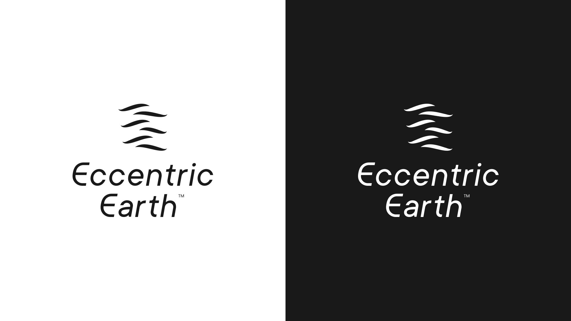
Neutral versions
Black, grey, and white versions for designs limited to a neutral palette, in both print and digital.
Nature’s own canvas
Deep Forest Green is the foundation, standing for growth and sustainability, and it carries the logo and most of the brand’s surfaces. Gamboge and Persian Orange bring in the warmth of earth and sunset, adding vitality and energy wherever the brand needs to feel bright and playful. Wafer, a soft sandy neutral, adds a touch of refinement, with black and white handling text and open space. Most of the palette pairs freely, and every colour works on Forest Green.
One family, every tone
A single geometric typeface carries the brand’s voice. Its rounded forms echo the logotype, and its full range of weights, from Thin to Black, lets it shift tone with ease: light and airy for product details, heavy and confident for headlines. One family keeps everything consistent without ever feeling flat.
The Brand in Context
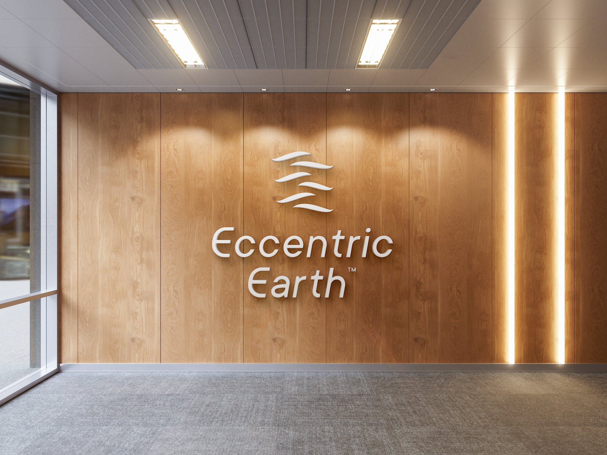
A brand inspired by the earth should look at home among natural materials. Eccentric Earth does.
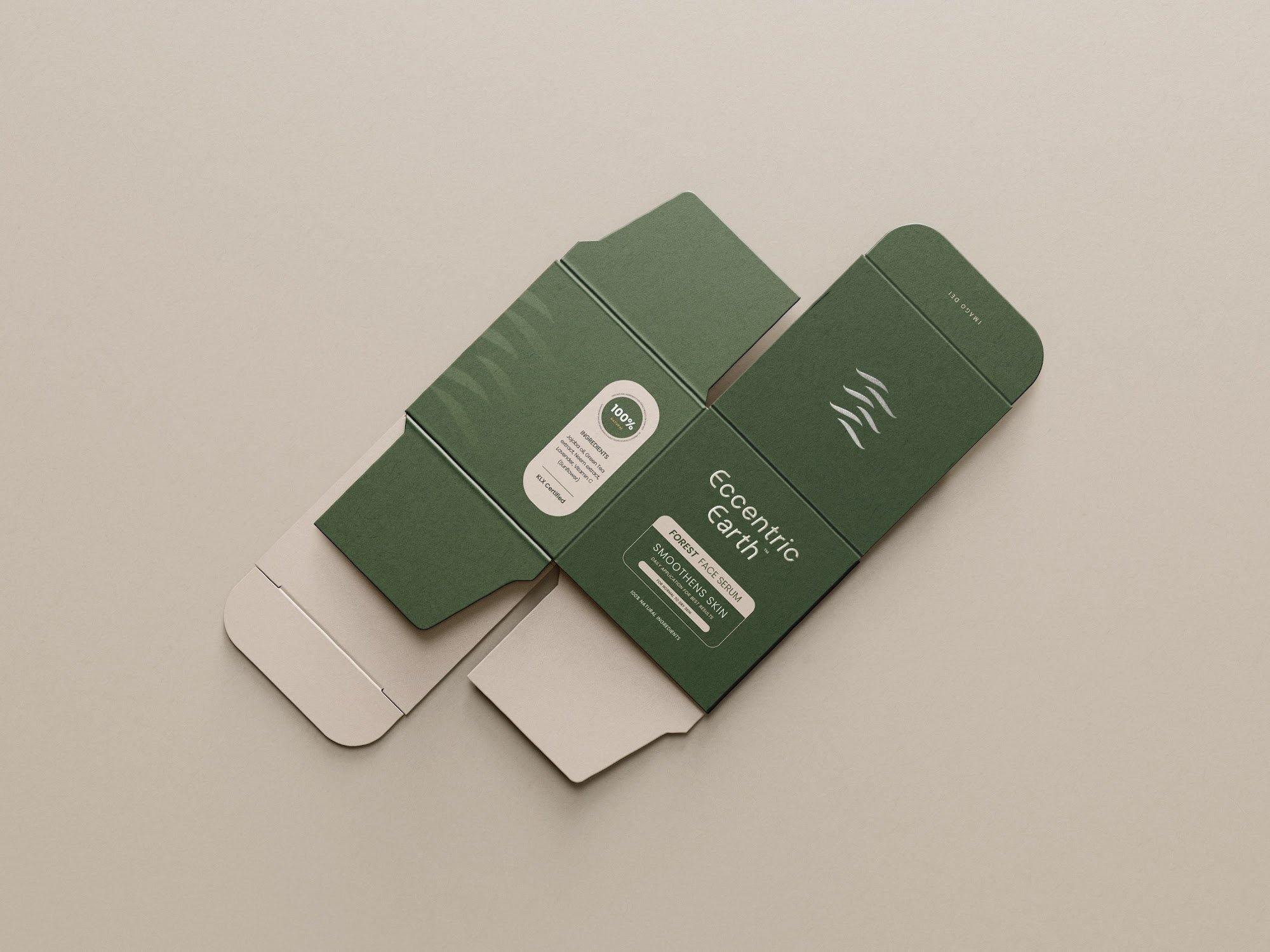
On textured, uncoated surfaces, Forest Green carries the whole piece. The logomark can sit tone-on-tone, barely there until the light catches it, while Wafer holds the details that need to be read.
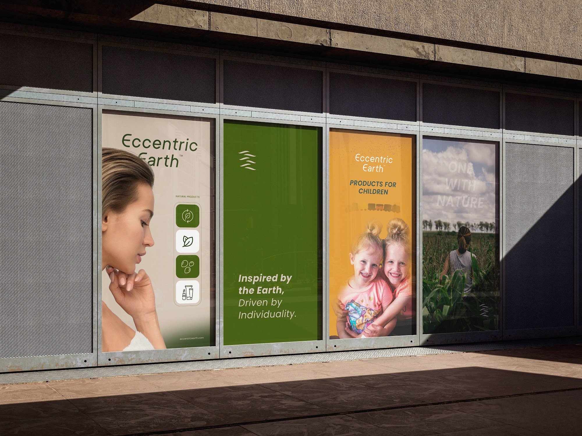
In a run of large panels, the palette shows its range. Forest Green brings calm, Gamboge brings play, and Wafer frames portraits softly. Side by side, they read as one brand speaking to adults and children in the same breath.
On a plain white ground, the logomark needs nothing else. Six green strokes are enough to say Eccentric Earth.
The Impact
A nature-led identity that stands apart in a category full of look-alike leaves.
A logo system that scales from a wall-sized lockup to six small strokes.
A palette that welcomes adults and children without losing its grounding.
Clear guidelines for spacing, pairing and type keep the brand together wherever it goes.
What We Learned
Let nature set the rhythm
Movement in the mark gave the brand more personality than any illustration could.
One mark, many jobs
The logomark became the pattern, the stand-alone signature and the quiet tone-on-tone detail.
Playful and premium can share a shelf
The balance of green and orange let one brand speak to two very different audiences.