



KOIN is an innovative platform that aims to revolutionize the world of sports coaching and athletic development.
Drawing inspiration from the Christian meaning of ‘Koinonia’, KOIN embodies a spirit of community, collaboration, and shared growth in the realm of sports and wellness.
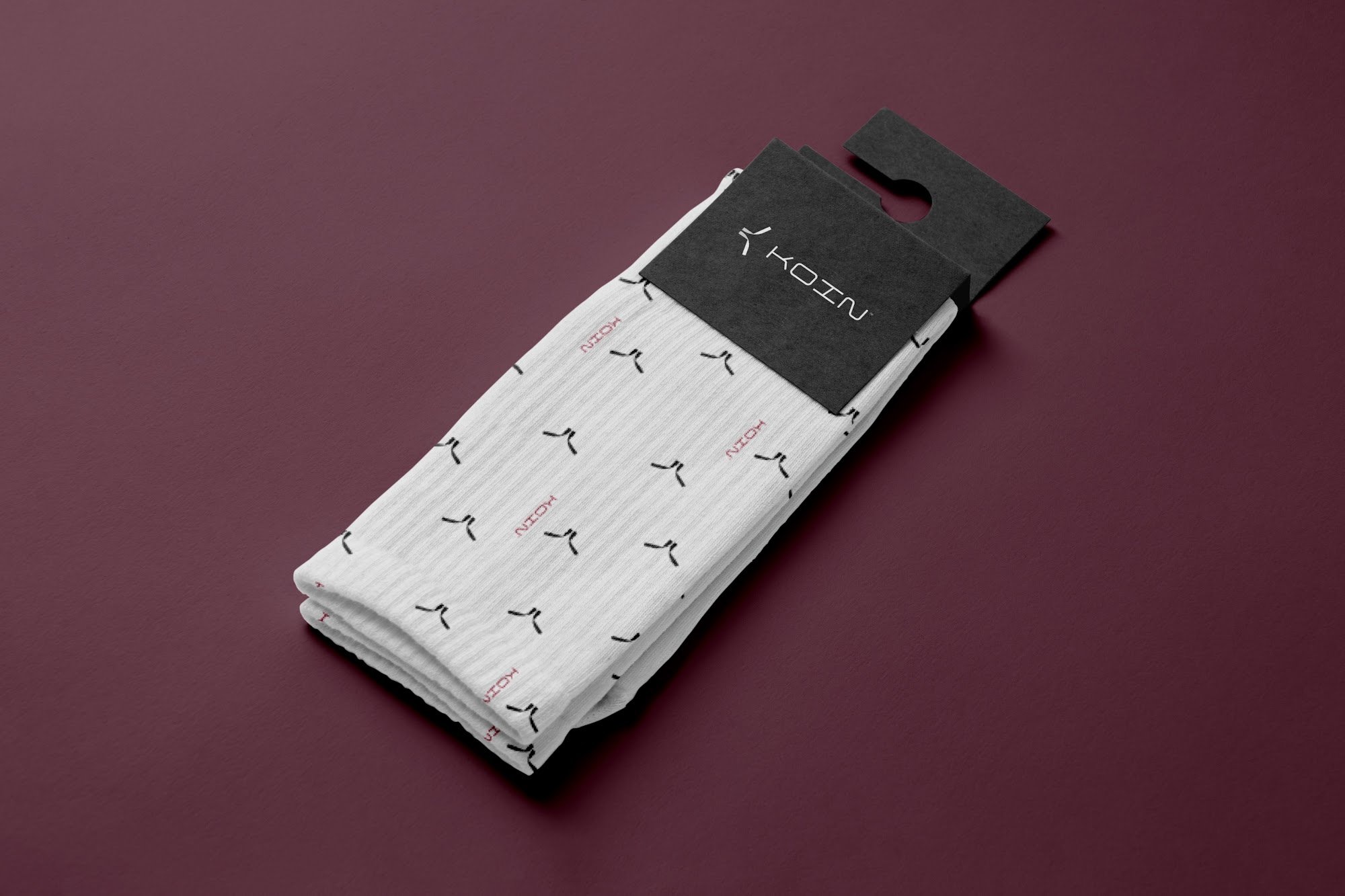
Elite coaching has always had a velvet rope. Koin’s brand had to take it down.
Koin wants to democratise athletic development, but in sport, credibility is everything. The brand had to feel premium enough for serious athletes and coaches to trust, and open enough that a beginner would feel welcome.
Our Response
A Mark in Motion
A K drawn from sweeping strokes and two claret bars, built to feel fast, precise and athletic.
A Palette With Two Sides
Oxford Blue for trust and professionalism, Claret for passion and the energy of competition.
A System Built for Sport
Clear rules for spacing, sizing, rotation and photography, so the brand performs the same way on every surface.
Two kinds of trust, designed at once.
We started with Koin’s mission: making top-tier coaching available to everyone who seeks it. That meant the trust of a coach putting their name to the platform, and the trust of an athlete putting their progress in its hands.
The Brief
Create an identity for a platform set on changing sports coaching and athletic development.
The Goal
Build a brand that feels premium and professional, while staying open and inviting to athletes at every level.
The Insight
Athletes respect discipline. The brand had to show the same precision Koin promises in its coaching, with nothing loose or decorative about it.
Who It Speaks To
Athletes
People at every level who want to train with real guidance. Bold colour and dynamic photography speak to their drive.
Coaches
The experts behind the platform. A clean, precise identity tells them Koin takes their craft as seriously as they do.
The Next Generation
Young and aspiring athletes who have never had access to top-tier training. An approachable, confident brand shows them it’s meant for them too.

Logo Variations
Trust and fire
Oxford Blue anchors the identity with professionalism and trust, reflecting Koin’s commitment to premium coaching. Claret brings passion and energy, the dynamic spirit of athletic achievement and the warmth of a community pushing each other forward. White and black provide versatility and contrast. Both are bold, so when one sits on top of the other, they’re used sparingly to create interest rather than compete.
Typography
with intent.
A geometric display typeface carries headings, titles and big statements. Its clean, modern forms match the precision of the logotype.
A versatile sans serif handles everything else: body copy, subheadings, buttons, forms, labels and the smaller text in social graphics. With a full range of weights, it keeps every detail clear and readable.

The Brand in Context
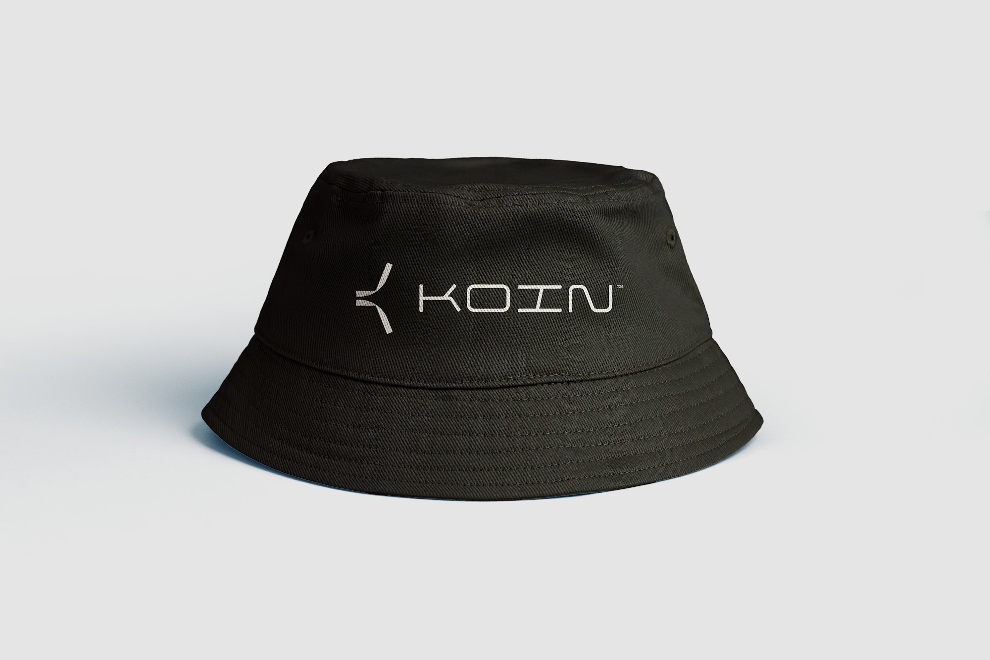
Sport happens on real surfaces, under real light. Koin was built to hold up there.
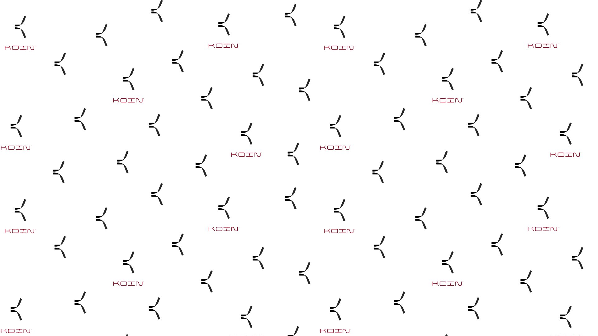
Repeated across a light surface, the logomark becomes a pattern. Scattered marks in black, with the logotype picked out in Claret, give the brand a playful rhythm without losing its precision.
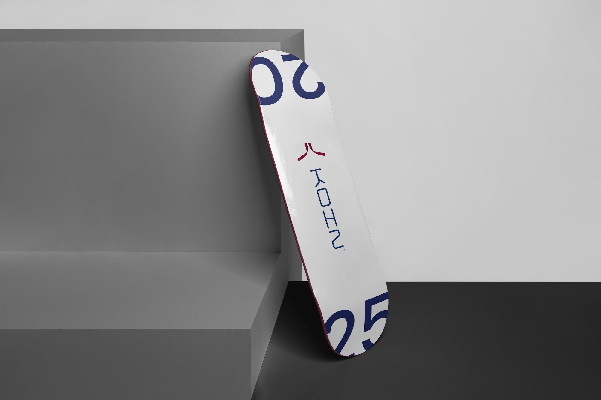
On clean white, the rotated logo shows how well the pieces work together. A Claret logomark over an Oxford Blue logotype, set vertically, reads instantly.
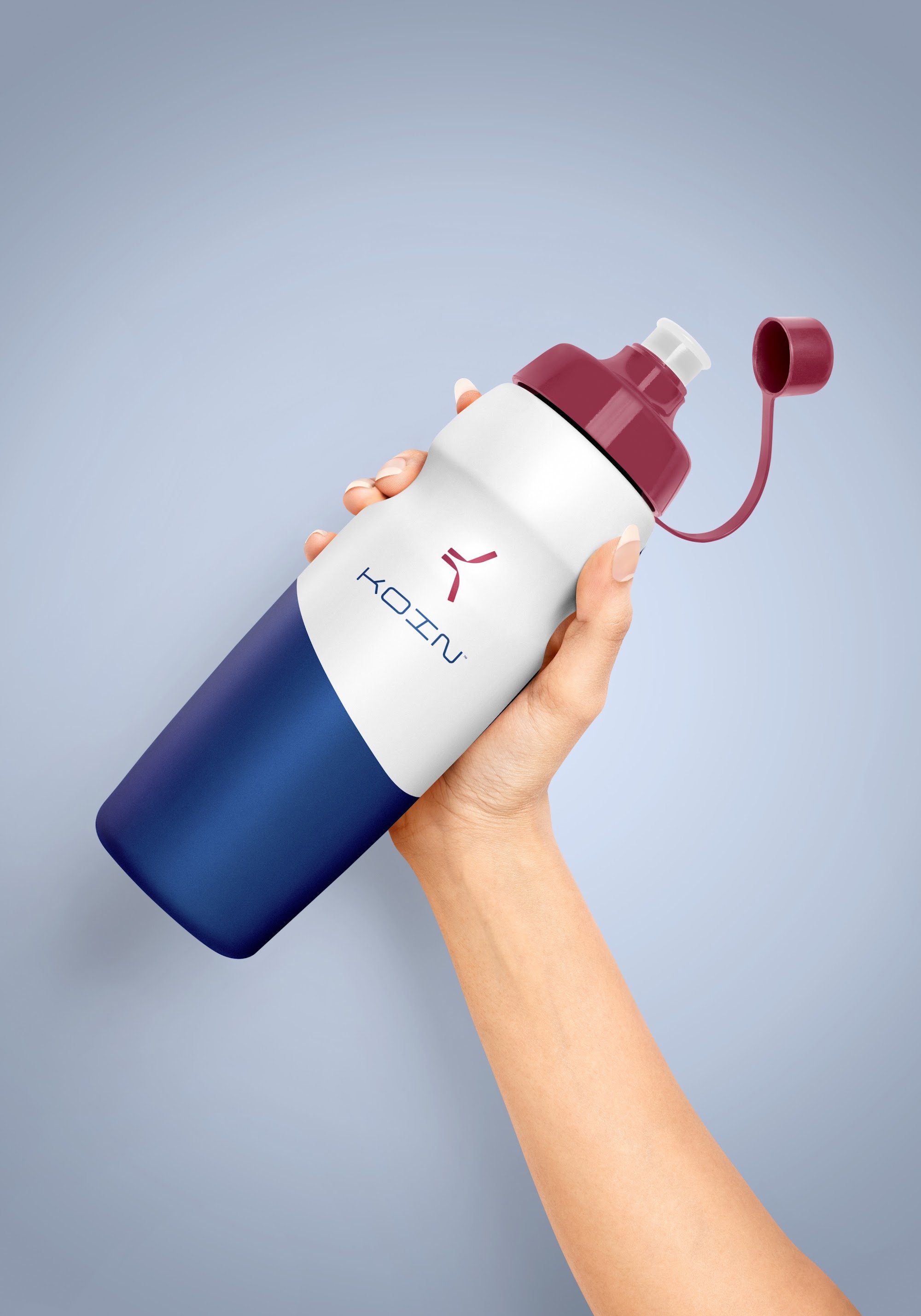
The Impact
An identity that gives coaches and athletes a reason to trust the platform from first sight.
A premium brand that still feels open to beginners.
A logo system that rotates, inverts and scales without losing balance.
Clear sizing, spacing and colour rules keep every touchpoint on brand.
What We Learned
Precision builds trust
In sport, a disciplined brand signals a disciplined product.
Premium doesn’t have to mean exclusive
The right balance of blue and claret made Koin feel both elite and welcoming.
Design for movement
A mark with motion built in works everywhere athletes do.
Systems keep the brand fit
Exact rules for sizing and spacing let anyone use the logo without it losing its shape.