
The From Chicago campaign stems from The GreyMatter Experience (TGME), a Chicago-based organization that uses entrepreneurship to narrow the opportunity gap for young people.
It provides students with tools, mentorship, confidence, and community to transform bold ideas into actual ventures.
For its 10-year anniversary, TGME aimed to brand the From Chicago campaign to demonstrate that Chicago is a place where ideas are conceived, cultivated, and realized. We collaborated with the organization to develop the campaign identity and assets.

Ten years of work deserved more than a birthday banner.
TGME has spent a decade turning some of Chicago’s most underinvested neighbourhoods into some of its most productive. The anniversary needed a campaign that told that story with pride: Chicago as a place where ideas are conceived, cultivated and realised, and its young people as the builders doing it. The identity also had to sit alongside TGME’s own brand, an anniversary emblem, the UNTAPPED event identity and partner logos, without ever getting lost.

Our Response
A Mark Drawn on the Map
The city’s grid, a dropped pin and a network of connections, built into the logo itself.
A Second Mark for the Milestone
A 10 Year emblem that speaks the same visual language and travels with the campaign.
A System With Rules
A modular pattern, a confident palette and clear lockup rules, so every partner, designer and sponsor builds it the same way.
The campaign grew from one organising idea:
Brilliance has an address
TGME’s students aren’t waiting to leave Chicago to succeed. They’re building right where they are.
The Brief
Brand the From Chicago campaign for TGME’s 10-year anniversary and show Chicago as a place where ideas are conceived, cultivated and realised.
The Goal
Give the campaign a mark rooted in place, and a system strong enough to run from June to December 2026 across events, print, digital and partner materials.
The Insight
These are builders, not recipients. Every choice, from the logo to the photography, had to show young people with vision and capability, never people waiting on sympathy.
Who It Speaks To
Students and Alumni
The builders at the centre of the story. The campaign shows them as they are: capable, specific and from here.
Chicago’s Neighbourhoods
The places the work happens. The grid and the pin put them on the map, literally.
Partners and Sponsors
The people who fund what comes next. Clear lockup rules give them a respected place beside the campaign without crowding it.
The Wider City
Anyone who still thinks talent has to come from somewhere else. From Chicago answers them in two words.
From Chicago
The campaign mark is a map you can read. Bold, staggered letters spell CHICAGO under a FROM label, and every element around them carries meaning.
The Grid
The faint lines behind the wordmark are Chicago’s street grid, its intersections and key locations.
The Triangles
TGME’s directional motif. On the Chicago grid, they don’t just point somewhere. They point here: this city, this neighbourhood, this address.
The Location Pins
The pin drops “brilliance has an address” onto the map. Not somewhere out there. Right here.
The Circles and Lines
The dots are students and alumni. The lines are the connections built between them through TGME.
The 10 Year Mark
The anniversary emblem shapes the same vocabulary into a number. A triangle caps the 1 and points down through the 0, and a single connected dot trails off its edge, the next line in the network.
It sits beside the campaign mark across event materials, the sponsorship deck and anniversary communications.
Logo Variations
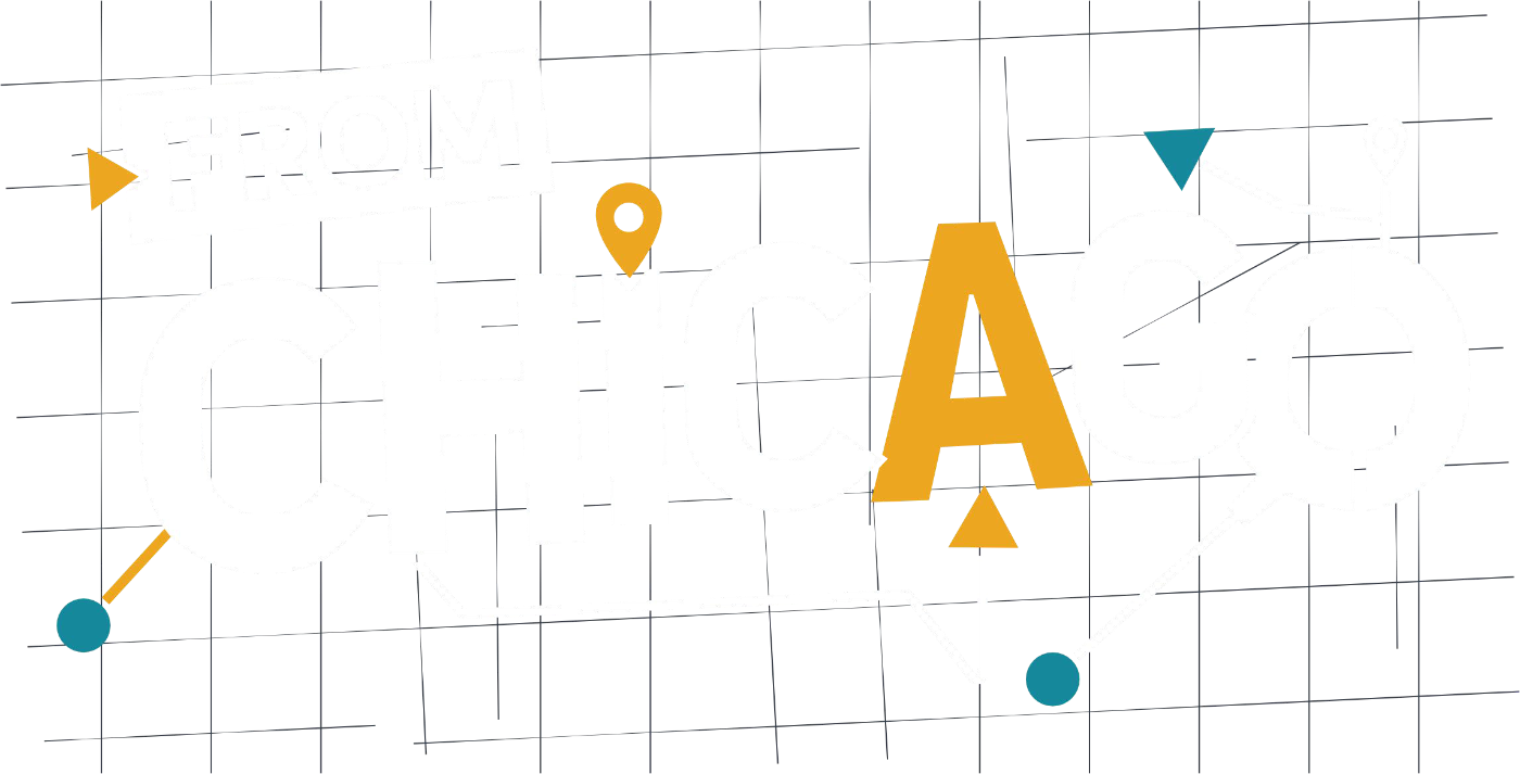
Main Logo With Grid
The full-colour primary mark for light backgrounds and every hero application, from banners to the program booklet cover.

Secondary Logo Without Grid
For photography and busy backgrounds, where the image already carries enough detail.

Monochrome
Ink Black or white, for single-colour print, merchandise and embossing.

Inverted
White with Amber Honey and Pacific Cyan accents on dark backgrounds, so the mark keeps its energy at night and on stage.



Both marks follow the same logic. A set of lockups decides how they pair with the TGME logo, the UNTAPPED event identity and partner logos. The campaign always leads, and nothing crowds it.
Colour
The campaign runs on a more saturated version of TGME’s brand palette, and the extra intensity carries the confidence of the moment. Pacific Cyan leads, Amber Honey brings the warmth and highlights, and Ink Black grounds everything. Tranquil Pond and Liberty Grey handle the quieter work of grid lines, light blocks and secondary detail. It’s bolder than TGME’s everyday brand, but still clearly part of the family.
Typography
A condensed, extra-bold display face leads at scale: event titles, banners, stage backdrops and section headers. Its tight letterforms say more in less space.
A clean geometric sans carries everything else, from subheadings and body copy to signage and social content.
A script accent appears sparingly, a single word at a time, to bring warmth to formal pieces like the UNTAPPED invitation and program booklet.
Pattern
The campaign pattern is built from the same geometry as the mark: directional triangles and bold colour blocks set on a grid. It’s modular, so each section carries its own energy and can be used on its own. The pattern supports a layout without ever competing with the logo or the photography.
Photography
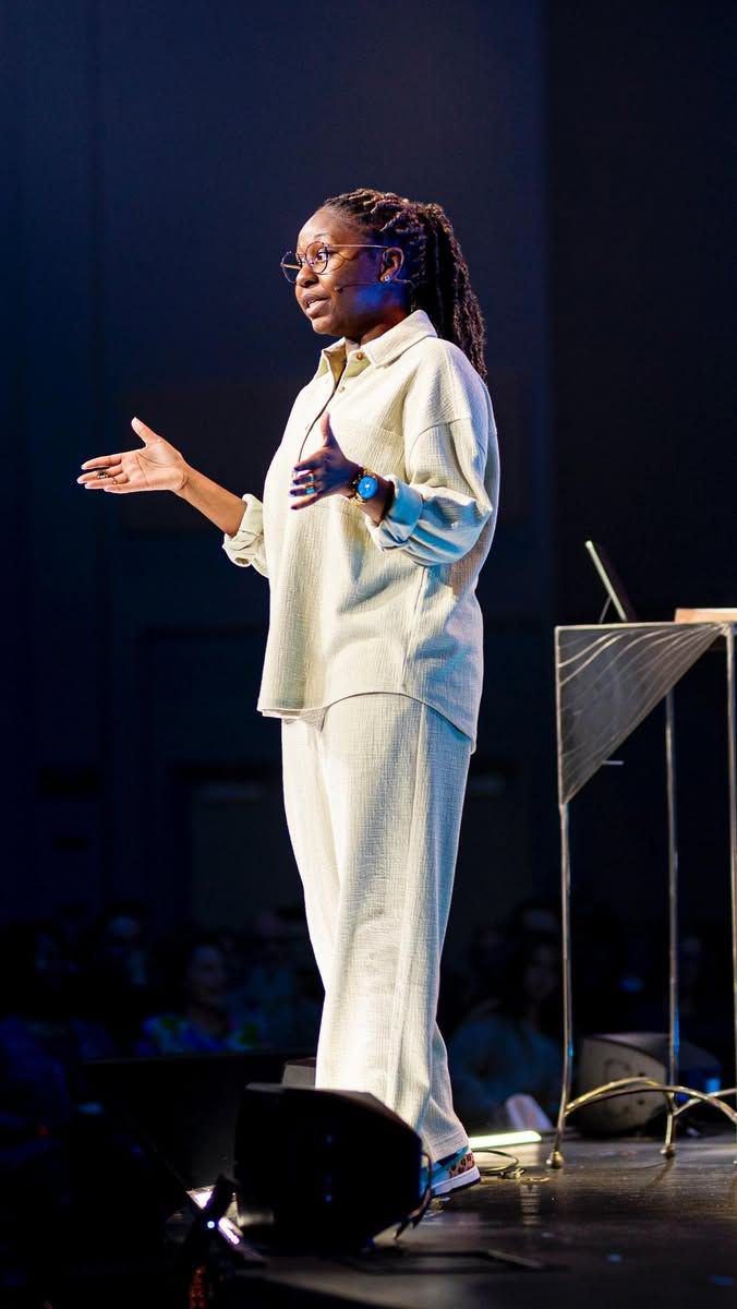
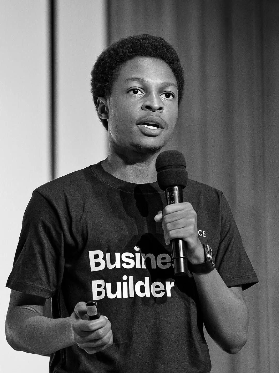
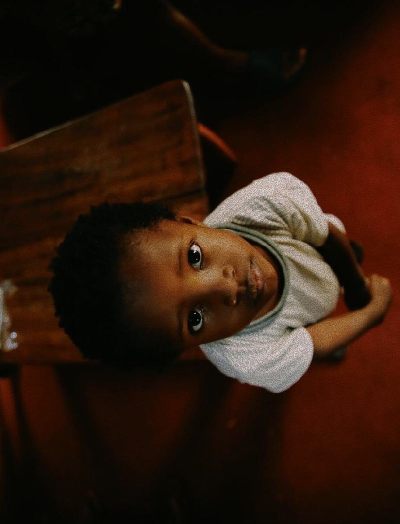
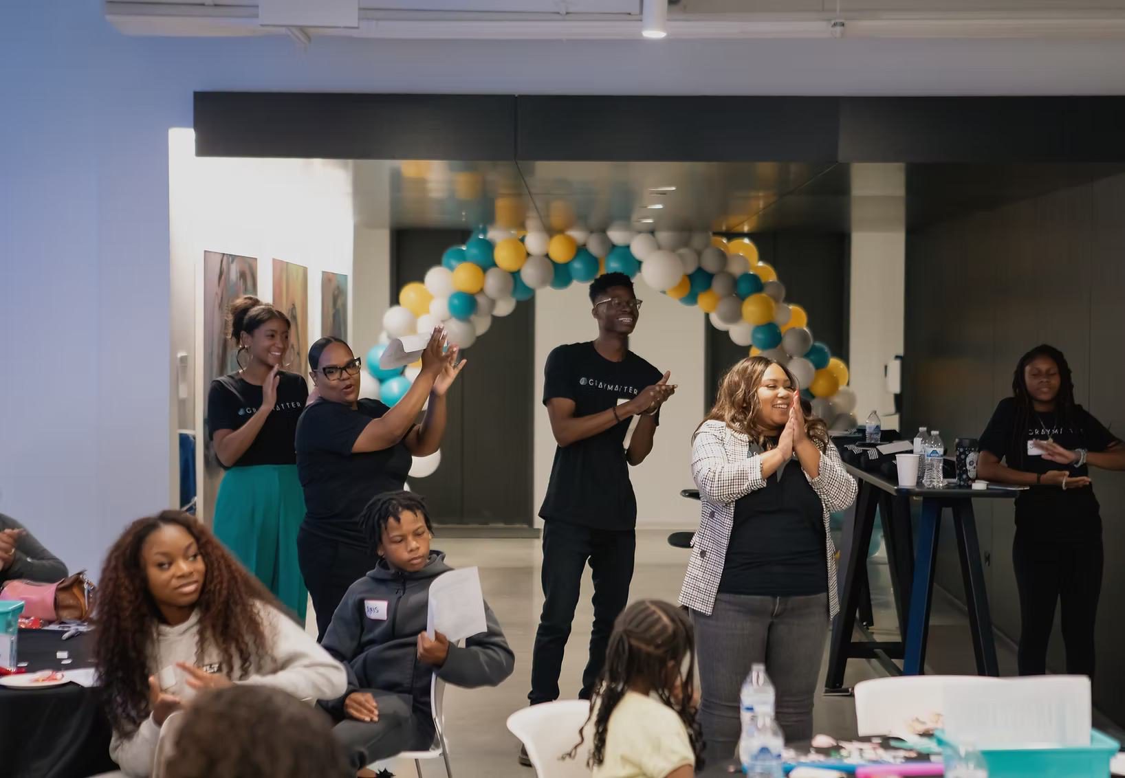
Every photo starts from the same premise: these are builders, not recipients. The direction calls for candid moments, natural light and real Chicago spaces, captured for credibility rather than curated for sympathy. Dignity comes first.

The Campaign in Context
A campaign about a place has to hold up in real places. From Chicago was built to live on event floors, in portraits and across a city’s worth of materials.

On portraits, the system flexes with the light. Against a flat Pacific Cyan sky, the all-white mark sits quietly in a corner and lets the subject lead.
In a warm, sunlit interior, the full-colour accents pick up the tones already in the room. The campaign grid can sit over either as a faint texture, tying every image back to the map.


Wherever it appears, the same idea comes through:
This brilliance was built here.
The Impact
A campaign mark that literally puts TGME’s students on the map of their city.
Two marks, one visual language, so the campaign and the anniversary always read as one story.
Lockup rules that give TGME, UNTAPPED and every sponsor a clear place without crowding the campaign.
Guidelines that keep seven months of events, print and digital consistent, whoever is designing.
What We Learned
Meaning makes rules easier to follow.
When every element of the logo stands for something, people protect it.
A campaign lives among other brands.
Planning the lockups early mattered as much as designing the mark.
Show builders, not recipients.
The photography direction shaped how the whole campaign feels about the people in it.